How do we prioritize online shopping from sustainable brands over cheaper and familiar fast fashion brands?
Ecostylist
A members only online e-commerce store strictly carrying sustainable & ethical fashion brands.

The Ask: Test and evaluate an existing product. Then leverage research to conceptually redesign.
Tools: Figma, Adobe Photoshop
Time: 3 Weeks
about the EXISTING PRODUCT
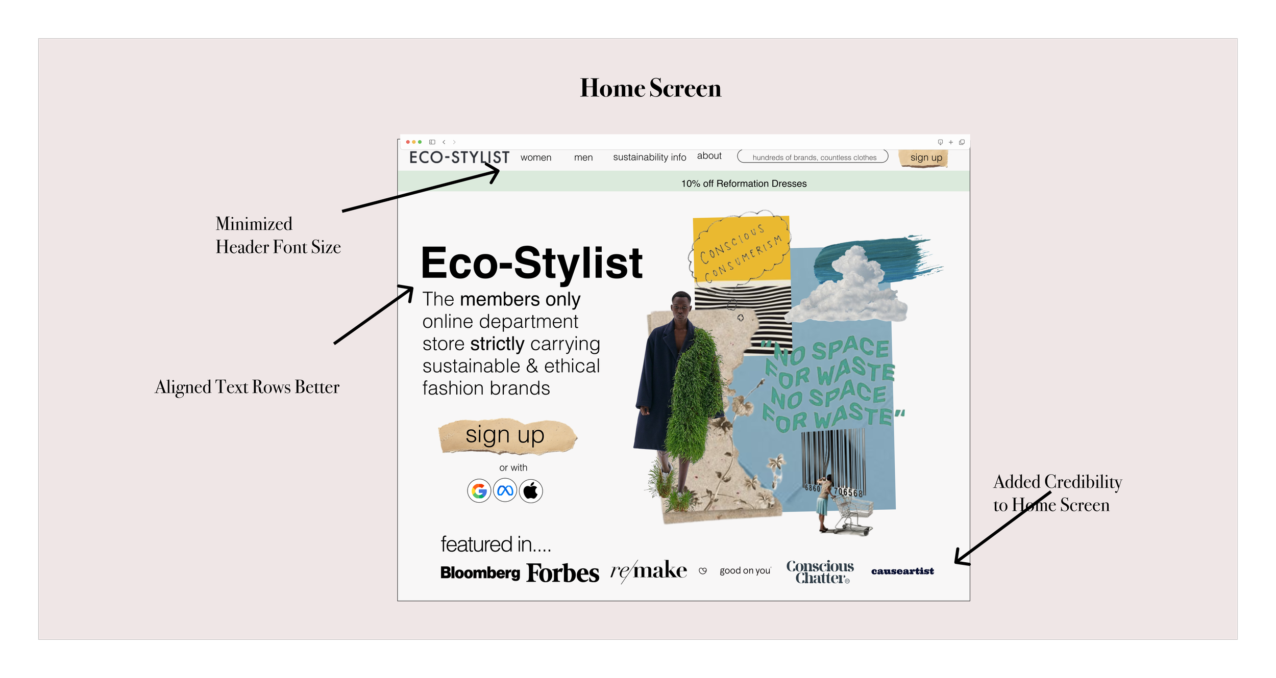
ECOSTYLIST
-
A sustainable brands directory + sustainable clothing e-commerce
-
Every brand listed is “Eco-Stylist Certified” (earn ratings based on company’s criteria)
-
Revenues through a Cost Per Click (CPC) module where commission is earned when a user makes a purchase using their link
audit
critiques || original journey map || site map || heuristic evaluation


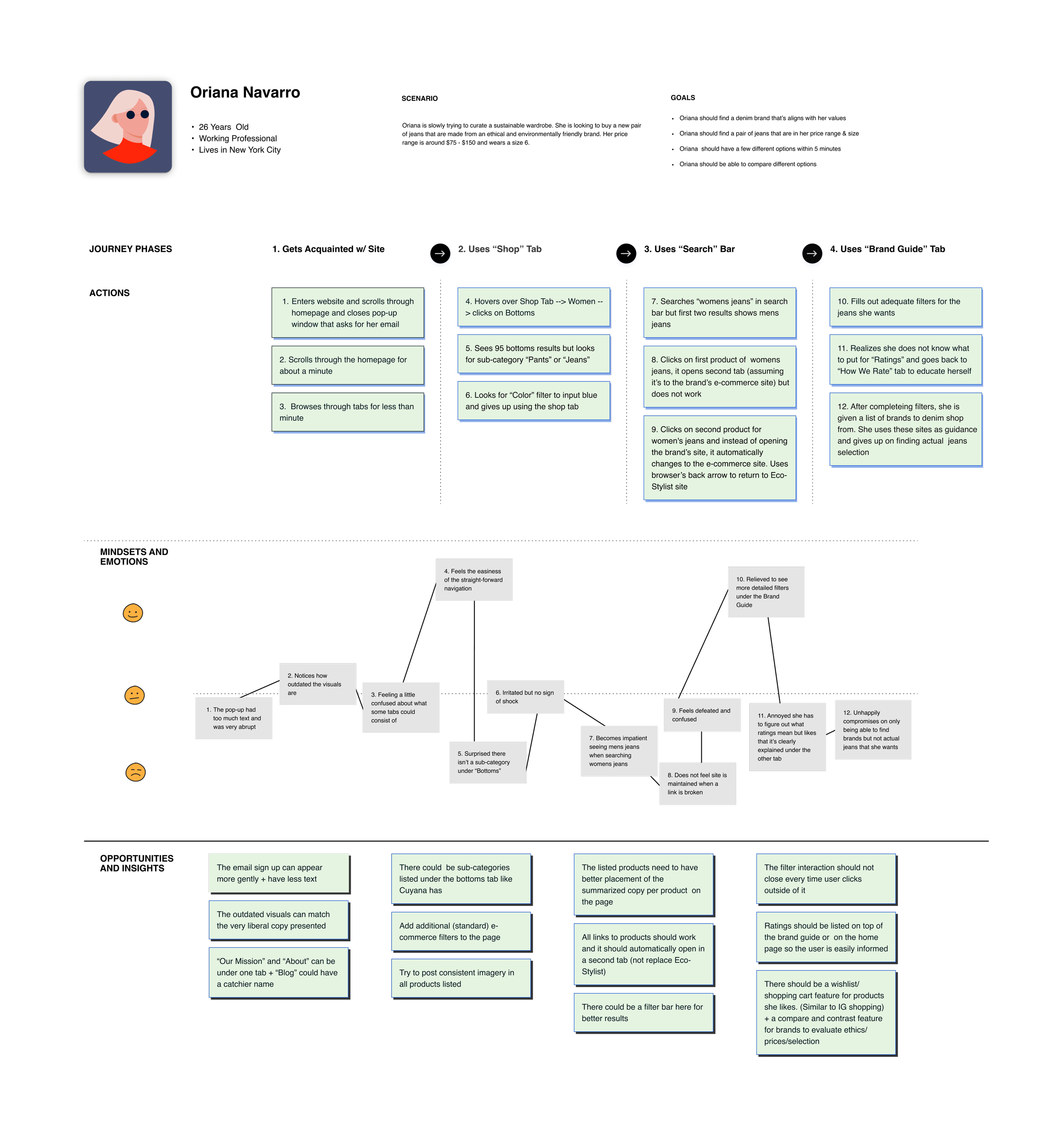
original journey map
ux research
9 Interviews (7 women, 2 men) conducted via Zoom
persona: Danielle benoit
Age: 24 years old
Occupation: Marketing Coordinator
Location: Austin, Texas
-
Danielle is a marketing coordinator at a beauty start-up. She loves to shop and dress nice, especially to take photos for her Instagram and go out with friends.
-
Sustainable clothing brands are too expensive
Guilt buying fast fashion
-
To curate a sustainable fashionable wardrobe, but still affordable

Interview key findings
Limited Styles - Sustainable brands have minimalist designs, doesn't cater to many styles
Expensive - Sustainable fashion can be more expensive than other competitors
Unaware - Doesn't know what brands are sustainable
Interview quotes
"I never buy sustainable clothes. I never found anything that's very me. I’m all about Stüssy and Supreme, very skate or rock street style. Clothes I like don’t come in environmentally friendly options.”
“I'll only pay for something if it's cute, sustainability comes second. So if there’s a regular brand with a product that looks the exact same but its cheaper - I would go for that."
“I would buy more sustainable clothes if I was educated. I’ll know if a brand is sustainable if my friends tell me.”
ux design
MEMBERSHIP MODEL || USABILITY RESULTS

tHE MEMBERSHIP MODULE
After research, once I started to sketching I realized I wanted to add a membership model to the UX.
———————-
Reasons….
1. Incites elusiveness to the site
2. Optimal checking out flow: they don't have to refill a lot of their information
3. Retains loyal customers
———————-
In hindsight, wish I thought of this idea while conducting interviews (instead of right before the sketching process)
4 tests conducted. ~30s to complete.
Usability tests before and after

prototype
what i learned
Don’t cross the line when auditing
Since this project was conceptual and I wasn’t presenting to an actual client, I was extremely critical of the original site. When it came to the redesign, I changed the tone of it completely. While my instructors did praise me for my innovative design, internally I knew I couldn’t have this much freedom if I was facing a client.
The key is thoughtful IA
Optimal Sort was an amazing tool to understand how an abundance of information should be grouped. As proven in my user tests. Users were able to gravitate to what they needed in the secondary window rather quickly.
Good UI is not show-offy
I was proud of my visual eye in this product. However, I know that the best UI can be measured by how much ease the user has experiencing the site. Next time, to save time and money, my focus will be to create a product that’s purely based on simplicity and ease.