HOW DO we design an app that enables city women to commute safely?
Bibti
An app for women to safely commute from point A to point B.

The Ask: Research and design a scheduling app for our client, Bibti. The product for women to find other women to commute with.
Tools: Figma, Adobe Photoshop
Team Members & Roles
UX Designer & Co-Project Manager: Sara Ashary
UX Researcher & Co-Project Manager: Jenny Jung
UX Designer: Yara Afshar
UX Researcher: Robin Ong
about the client
BIBTI
-
An app for women to safely commute from point A to point B
Honesty and integrity are the core of its’ product values
Based in Washington D.C
Freemium Model
-
Gen Z & Millennials
Women living in urban cities
College Students/Young Working Professionals
-
Main point of contact with client
Project managed team’s deadlines
Spearheaded Component Library & UI Design
ux research
9 Interviews conducted via Zoom
persona: Jessica bruin
Age: 20 years old
Occupation: Student
Location: Washington DC
-
Jessica is a marketing coordinator at a beauty start-up. She loves to shop and dress nice, especially to take photos for her Instagram and go out with friends. motivated.
-
Ride share apps are too expensive
Not enough friends live near her
There's too much violence against women
-
Safely get from Point A to Point B in her college town at night
Not to feel any threats or danger while walking
Knows that if something bad happens, help can come ASAP
-
Latino Student Union, Reading, Lacrosse Club, Going Out With Friends
-
Social Media: ✩✩✩✩✩
College Newspaper: ✩✩✩
Apple News App: ✩✩
Word of Mouth: ✩✩✩✩✩

Interview key findings
Calling Someone - Would call a friend while they feel unsafe walking alone at night.
Asking a Stranger - Would not ask walk home with a stranger unless there is enough information.
Do No Plan Ahead - They don’t plan how they get home ahead of time
our response
This tells us that users seek companionship and trusted social interaction when they feel unsafe. Users can chat with their walk buddies to plan together.
This tells us that Bibti's number one priority should be to make the user feel safe and put trust in us. Profiles have photos , reviews, and their Instagram linked
This tells us that users need options to use Bibti "on the go" with a live map of other buddies to walk with while still being able to schedule trips ahead of time.
DESIGN


ux design
User Flows || Sketches || Usability Test Results || Component Library
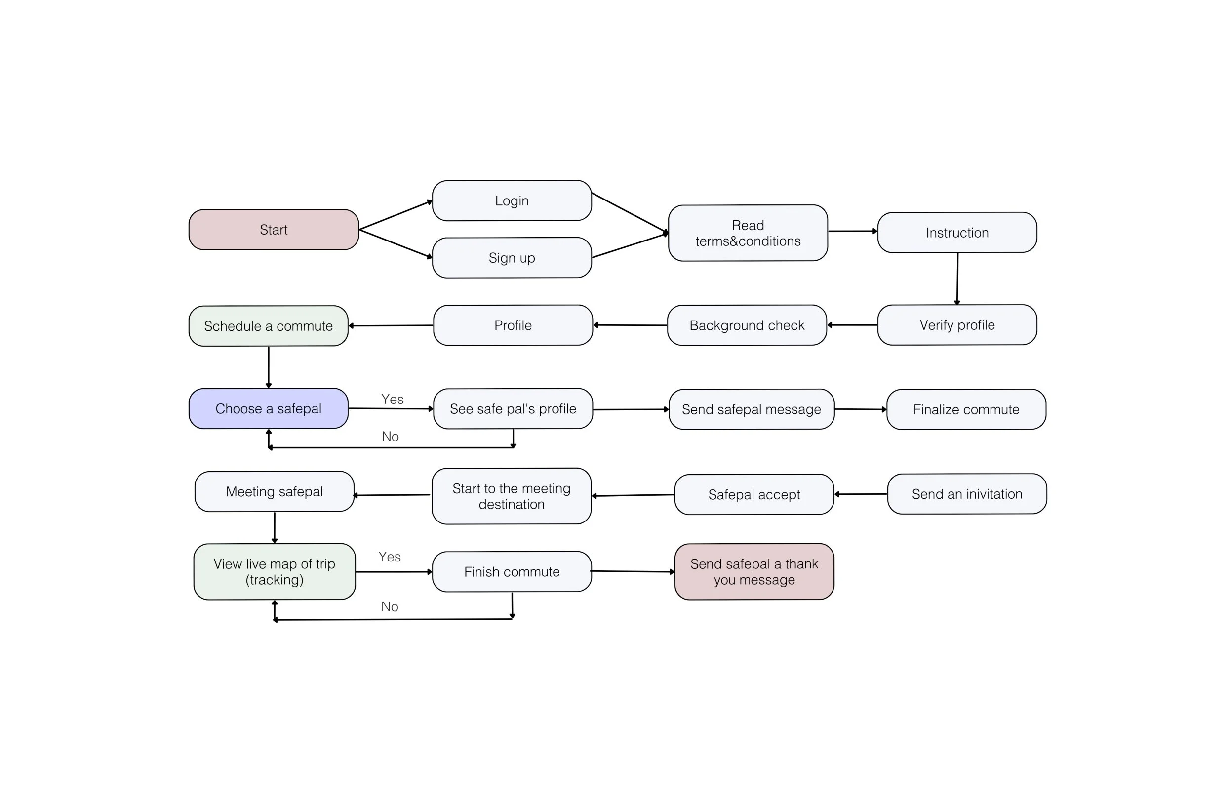
User Flow
SKETCHES

4 tests conducted. ~30s to complete.
Usability tests before and after


journey map
Our map shows users felt confused during the most vital part of the journey, scheduling a commute. We had to go back to the drawing board and rework our user flow.

COMPONENT LIBRARY

-
Thankfully, our clients had a color palette in their Brand Guidelines deck. However, we did independently decide on the gradients.
-
Similar to the color palette, we were given what fonts to use from the Brand Guidelines. however we did decide on the weights + text slots.
-
While we went safe with the icons, we were keen on making sure many of the shapes had thinner and lighter lines.
-
We decided to make our buttons a traditional with a minimalist style. Our colors for the buttons were decided on what looked the best on our background screen color, then what looked second best and so on.
-
The logo was given by Bibti, they did a great job explaining that the logo symbolizes motion and how women are always on the go.
-
We created a variety of avatars and an avatar creation user story. We also added some imagery of diverse women + non-binary user to make sure the app stands for representation.
prototype
what i learned
Teamwork makes the dream work.
As the project manager, I initially denied my tonsillitis during the project. However, my team was highly cooperative, and Jenny seamlessly stepped in. Upon my return, they briefed me, and I integrated myself without disrupting ongoing work.
I also discovered an efficient method for making minor UI/UX edits after prototyping by creating a Slack checklist (requiring a plugin) for the team to collectively manage. Additionally, I appreciate the practice of keeping our Zoom cameras off but remaining on the call when we're all focused on work.
Where’s the boundary line?
My team did a good job in reminding me that we shouldn’t stretch ourselves outside what the ask was unless they asked us. As much as we want to please the client, it’s important to never do extra work assuming the client would like it (i.e. making additional user stories than what was originally asked). This also enabled us to stay focused and prevent any burn-out!